Feature available in: PRO and ADVANCED PLANS
(US, UK, Canada, Australia, France, and Belgium only)With “My Metrics” on Smappen, you can now create a custom view on your map. Instantly visualize in one unique view:
- The demographic data from the Census that matters most to you.
- The results of your Points of Interest searches.
- Your own data imported onto the map.
Then, perform calculations to analyze your areas more in-depth!
📖 TRANSCRIPT
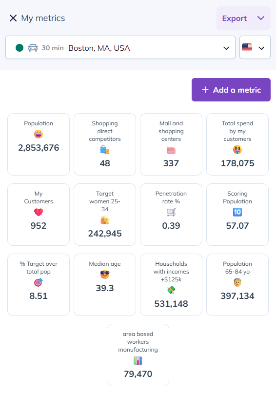
In this video, discover the “My Metrics” feature, which allows you to bring together all your key metrics for analyzing your areas, performing calculations on this data and exporting a summary table of all your results.
Let’s start by opening the My Metrics tab to create your custom dashboard. This will let you bring together, in a single view, demographic data, points of interest, and your imported datasets.
To add a metric, click “Add a metric” and give it a name.
In this example, we’ll look for the median age of the population. You can also choose a symbol to make it easier to identify your indicator.
Next, click in the formula bar, type a keyword, and select the relevant tab — here, Demographics. Choose the desired metric and save it.
You can repeat this process as many times as needed to create all the metrics you want.
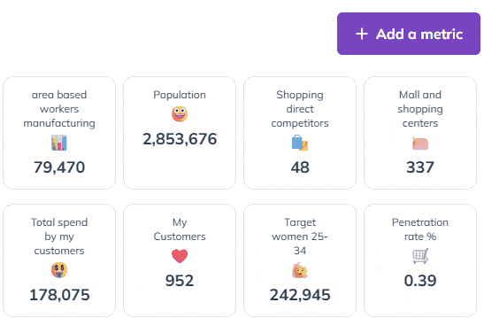
Going further, you also have access to calculations like addition, subtraction, multiplication, and division. Here are a few concrete examples:
Combine several age groups to define your target audience:
To calculate the size of your target population within an area, go to the My Metrics tab. Here, you can add multiple age groups together, for instance to define women aged 25 to 34. Create a new metric and give it a name.
Next, select women aged 25 to 29, then add women aged 30 to 34. Save, and your target is ready.
Calculate your market penetration rate:
You can also calculate your penetration rate to see what percentage of your target you’re actually reaching in a given area by combining imported data with population data. The formula is: Number of clients / Target population x 100. And here it is.
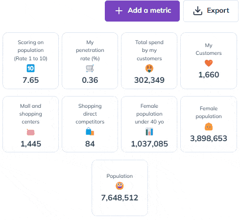
Create a scoring system to compare your areas at a glance:
Finally, you can enhance your analysis with a scoring system, which helps you compare areas. The idea is to give a score to each area based on a specific criterion. For example, let’s say you consider an area commercially viable if it has at least 500,000 inhabitants. You can assign a score from 1 to 10. If the area has 500,000 inhabitants, the score is 10 out of 10. To calculate this, use: Population / 500,000 x 10. In Raleigh, that gives me a score of 8.45 out of 10.
And now I can compare it easily to my other locations.
Once your metrics are set up, you can also download a summary of your metrics in Excel format with just one click.To compare all your areas,the Advanced plan allow you to export your metrics by folder, or for the entire map.
Now you know how to customize your metrics in Smappen to take your analyses even further!
Visualize and analyze a metric using its Heatmap
You can visualize each of your metrics through its heatmap. This provides an additional level of analysis and allows you to refine your strategy at a glance!
In the example below, I want to see the areas where my target density is the highest. To do this:
1. Click on the “…” in the top right corner of the corresponding metric.
2. Click on “Heatmap”
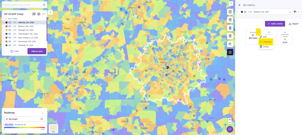
To explore all the possibilities of the Heatmap feature, click here.
Add a new metric
To add a metric to the existing ones, simply click the “Add a metric” button.
Edit or delete a metric
1. Hover over the metric with your mouse
2. Click on the three small dots at the top right
3. Click either “Edit” to modify your indicator or “Delete” to remove your metric
You can also reorganize your metrics:
- Hover over a metric
- Grab it and drag it to easily move it around
To go further :