Feature available in: PRO and ADVANCED PLANS
(US, UK, Canada, France and Belgium only)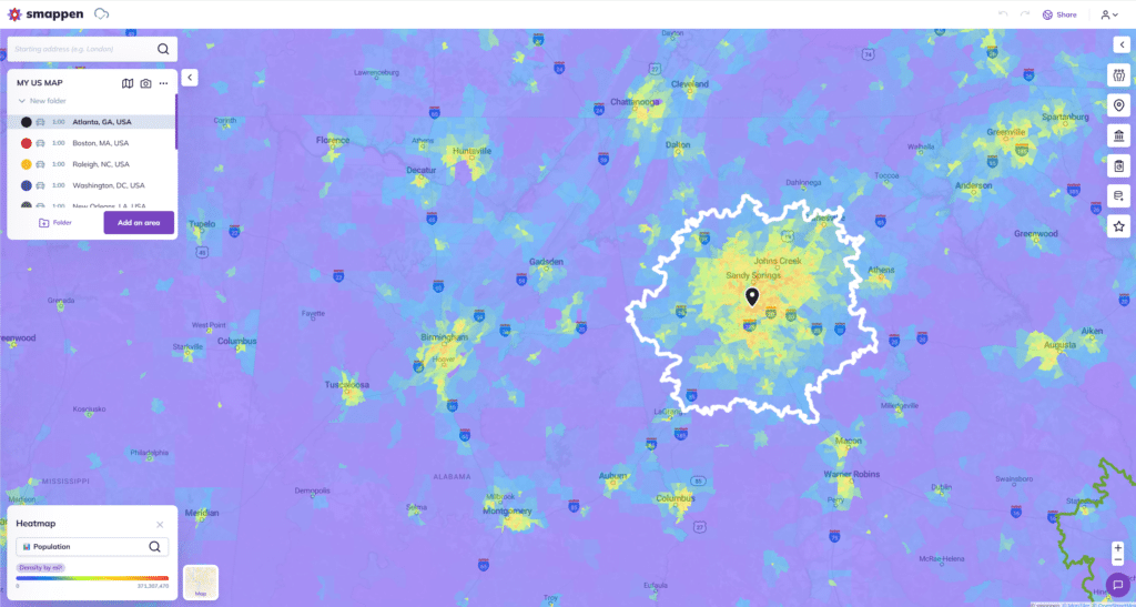
The Heatmap provides an intuitive way to analyze data using colors. By displaying density levels or ra data, you will be able to quickly spot where your target audience is the most concentrated.
This feature in currently available for your areas in the United States, the United Kingdom, in Canada, in France and in Belgium.
Glossary:
– Census Block : it’s a breakdown specific to the censuses carried out by each country
– Density: value per km² (relative to the Census Block surface)
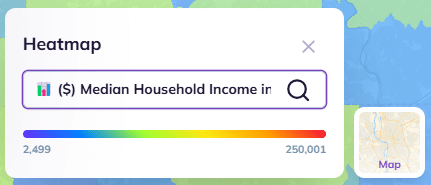
– Raw data: value on the Census Block (for example, the median householde income is displayed in $ for the population of the area).
1 – To display the heat map, click on the “Heatmap” button located at the bottom left of your screen

2 – Click on the search bar to navigate between different sources:
3 – Select the data you want to analyze from the drop-down menus or use the search bar:
You can choose betwenn :
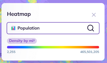
– the population data (from the Census)
– Your own imported data
– the points of interest searched you have created
– your own metrics
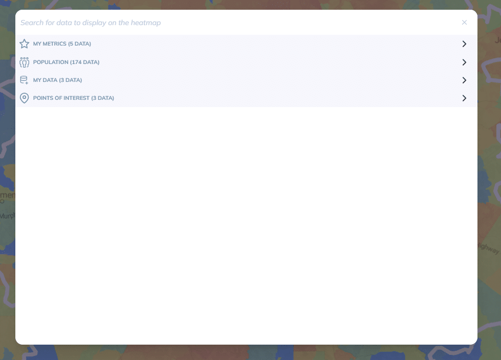
Population:
- You can pick one of the 174 census data available in the US or one of the 70 available in the UK
- Data will be displayed by default in density
- NB: Data without a purple label “Density by Km²” are displayed as raw data
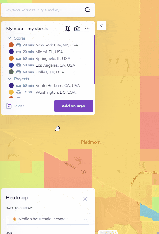
My data :
- Find the list of your imported data and different columns
- You can select the # of results, the sum, or the average
- NB: By default, the number of results is displayed in density, while sums and averages are displayed as raw data
Points of interest :
- Find the list of previously created business and service searches
- NB: By default, results are displayed in density
My Metrics :
- Find the list of metrics you have previously created
- You can choose to visualize data in density or raw data: we recommend density for indicators based on countable data (for example number of inhabitants, numper of POI etc)
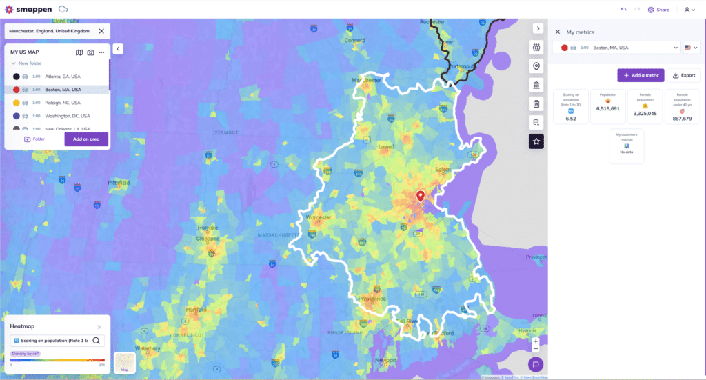
On the heatmap above: I visualize the indicator “score – target” created from a calculation “(number of people aged 18 to 39 / 400000) * 10”
4 – The results appear on your map:
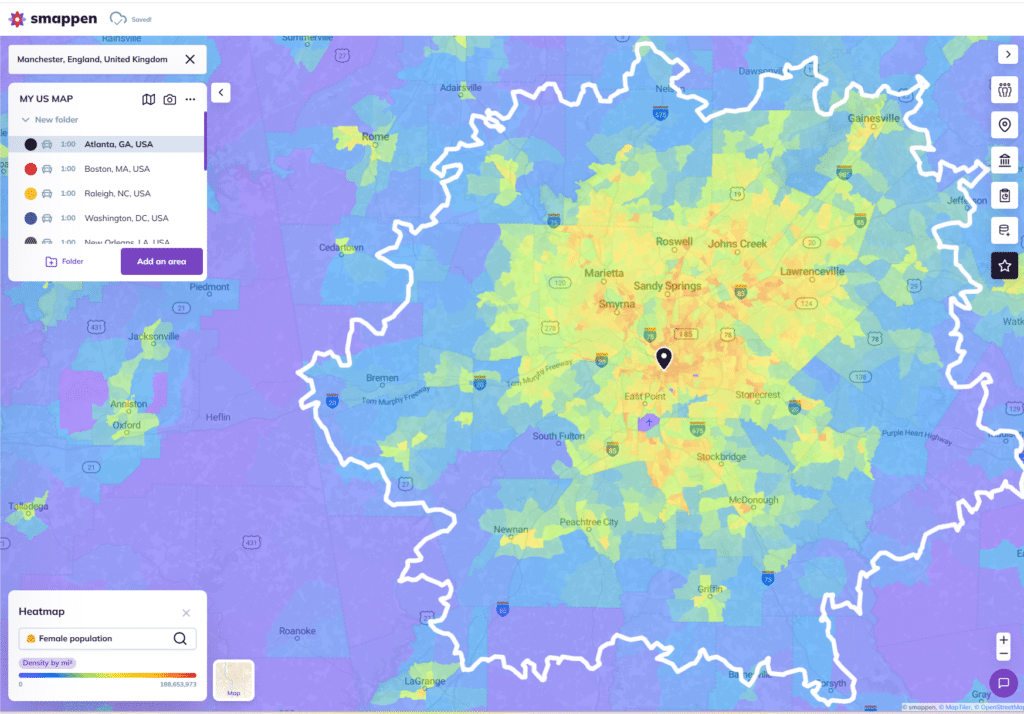
You can quickly determine in which area(s) your target is concentrated, how your indicators are distributed, as well as all the data from your dashboard.
5 – Creating areas based on the Heatmap is also possible.
- Display the heatmap on the map.
- Select “Add an area”.
- Choose either a manual area or an administrative area based on the zip codes (only available in the United States, United Kingdom, Canada, France and Belgium)
NB:
– The heatmap is created based on Census Block divisions
– Grey represents the absence of data, and purple represents data equal to 0
To go further: