Despite the fact that we all have a tiny GPS in our pockets, we still see maps on a daily basis. Whether you’re looking for a place to eat or crunching data for an important presentation, maps are still crucial. One example of a map that’s widely used in a ton of fields? The demographic map.
But what is a demographic map? Let’s define this term, look at how it’s used, and go through a few examples.
What is a demographic map?
You’ve probably already run into one without realizing what it is. A demographic map is a geographical representation of demographic data using any kind of map. Some of these maps are incredibly detailed — often using high-resolution heatmaps and similar techniques — while others use simple, flat-colored blocks to represent demographic data.
The scale of these maps can vary broadly depending on your field. A demographic map could focus exclusively on a single neighborhood, or it could represent data across an entire continent. But no matter the scale, they’re always used to represent demographic data visually by tying it to a location.
What are some examples of demographic data?
The term demographic data refers to a data set that focuses on socio-economic elements, usually linked to geography in one way or another. Here are some examples of the kind of data you’d find on a demographic map:
- Population density: How many people live in a specific area? That’s what this data point is all about.
- Employment rates: You might see this kind of data on maps from government institutions.
- Type of housing: Crucial for municipal zoning and similar initiatives, this data tells you if a neighborhood has mostly single-family dwellings or other types of housing.
- Income inequality: Calculating the spread between the highest and lowest incomes in a specific area is valuable for organizations aimed at improving the socioeconomic status of people in that area.
- Education level: This kind of data is used by census-takers, government institutions, and other similar groups.
5 industries that use demographic maps
Demographic maps are incredibly useful, so it’s no surprise that they’re used across a number of industries. So much so that you might have used them without even knowing what they were called. Here are some industries where demographic maps are essential.
Education
Some of the first demographic maps you’ve seen were probably in a textbook somewhere. That’s because they’re a great way to represent data in a way that most people can understand. Whether you’re learning about economics, history, or geography, a demographic map is a great learning tool.
Politics
Politicians use demographic maps to know more about the people they need votes from, but they’ll also use them when they’re on the campaign trail. Ever seen a campaign talking about some big electoral issue like crime or unemployment with a map? It probably included a demographic map.
Government
Census data, zoning laws, and municipal services are all examples of government projects that rely on a demographic map. Some of these are used internally for planning purposes, while others are created to help keep the public informed.
Activism
Activists will often drum up support using visual aids, and demographic maps are just one example of these. Many of the socioeconomic factors that are common for demographic maps fit right into activism, from income inequality to population density and employment.
Business and retail
In these industries, demographic maps are often used internally. A marketer will use them to plan their initiatives, business strategists might leverage them when planning for a new location, while an analyst might want a demographic map to analyze customer behaviors.
Economics
Economists love demographic data; it’s at the core of their theories and helps them better understand how people spend their hard-earned money. That makes demographic maps incredibly useful since they can evaluate how demographics impact spending habits in specific locations.
5 examples of demographic maps
More of a visual learner? Not a problem. Let’s go through a few examples of demographic maps — some of which you might already have seen.
Median household income in the U.S.
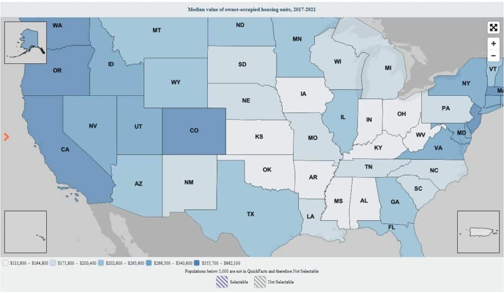
This demographic map shows the median income for American households, divided by county. This is an example of a heatmap; counties with higher median household incomes are darker, creating a high-contrast map.
Disproportionately popular jobs in the U.S.
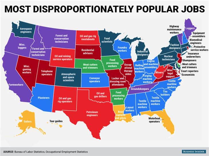
You don’t necessarily need a heatmap or other advanced data visualization methods to create a demographic map. In this map, simple block colors that follow state lines are more than enough to get the point across.
Population density in Ontario
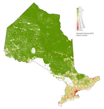
This demographic map also uses the heatmap method to represent demographic data. In this case, the population density in Ontario. Heatmaps are often used for demographic maps because they’re high-contrast and easy to create.
Customer location and demographics map
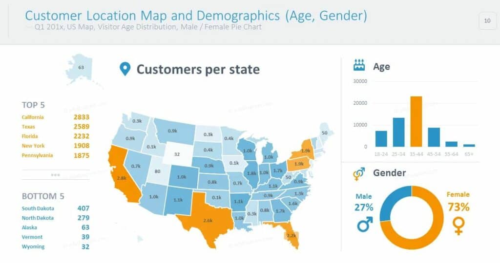
Here’s an example of a demographic map used for market research. This map uses simple colors rather than a heatmap, but it still communicates a ton of information, including the number of customers per state, their age, and their gender.
The map you make with smappen
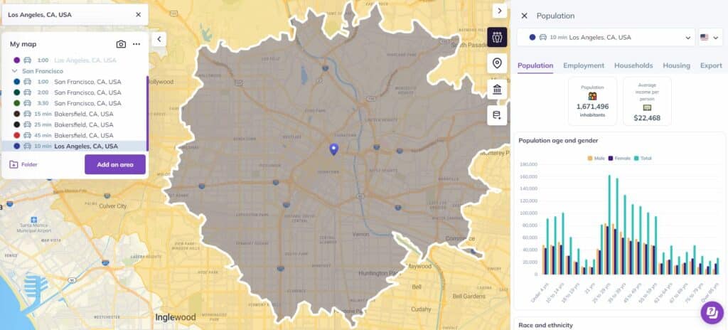
Smappen is a location intelligence application you can use to quickly create demographic maps that help you make better business decisions. Start with an address, create a radius map, and you’ll get deep demographic data from that area. You can create areas based on distance, travel times, administrative boundaries, or even manual inputs. It’s one of the best ways to create demographic maps without breaking the bank. Start using smappen for free and see it for yourself!
Off the map
A demographic map pairs demographic data — usually socio-economic factors — with a map to represent how that data interacts with physical locations. You might be looking at a map breaking down voter turnout per electoral district, showing median household income per county, or even just representing your customer base by location. They’re incredibly useful, and with a tool like smappen, you can make your own in just a few clicks.